Being a technologist sometimes means that you’ve built a network around other technologists who deal with the how and what of technology rather than the more subjective roles dealing with the for whom and why. Not everyone is fortunate to end up in the right social, academic, technical, or financial environment for the direction they need to thrive. These conditions can limit the exposure technologists have to projects or organizations that more closely align with their social impact goals.
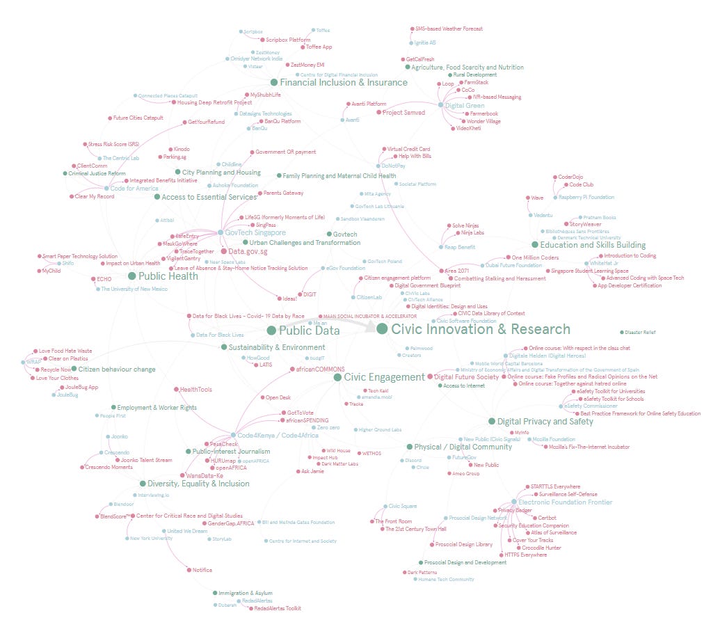
The PubinTech Project Map is the first experiment/initiative PubinTech started to help technologists understand the profiles of projects and organizations that value their expertise. This post explores how this project developed as a case study on one way to approach helping technologists improve their network.
Any tool to help with highlighting projects and organizations has to have a good balance between providing as much information as people need to make decisions and follow up, yet not overwhelming them to the point that the tool isn’t worth the effort.
One important feature we included in the Project Map is the Public Interest Area category. A public interest area is cause a project aligns with which serves the common good. As with public interest law, there is no concrete list of what is considered public interest. The map identifies 25 Public Interest Areas, including:
Prosocial Design and Development
Citizen Behavior Change
Immigration & Asylum
Disaster Relief
Public-interest Journalism
Public Data
Employment & Worker Rights
Access to Internet
Public Health
Another important feature in this project map is the location because it helps people identify where may have great ecosystems for their desired types of projects. Someone could, for instance, This can be tricky because some projects aren't localized to one city or leverage being in two or more places for operational reasons. There's also a difference in identifying countries versus cities. Both have value and importance depending on the scale and public interest area.
In addition to these individual features for each project and organization are two relational features: Launched and Related To. The relational features allow you to start forming associations between organizations or projects based and helps form the clusters that are more visible when you first open the map. All of these features serve a purpose in being able to reflect the public interest ecosystem.
This exercise showed that you don’t actually need a lot of information for the map to start being useful. The features mentioned above were enough for people to already start understanding the profile of projects.
Since the Project Map is an exercise in understanding the ecosystem, technologists aren't the only people to benefit from the Project Map. For instance, this sort of database is useful to public sector innovation or project leads who want to understand how certain unfamiliar technology is used in their areas of interest. Signposting these projects helps provide examples or potential contacts for people if they wish to develop a similar project in their area. Funders with social impact targets can also use this sort of database to understand the culture and opportunity of projects within their preferred location, technology, and/or public interest area.
To give an example, you might be interested in civic engagement projects in Africa. You can look at the Civic Engagement node and find an organization like amandla.mobi in Johannesburg or Code4africa which has been tagged as Nairobi but has continental influence and outreach. You can check out the projects they launch and decided to reach out to them. One of the most fascinating aspects of creating a database like the Project Map is discovering how people can use it to form their own public interest initiatives.
This Project Map already provides enough information for people to start looking at trends as well as how projects and organizations are positioning themselves. Creating a tool for analysis doesn’t have to be complicated to start being useful.
With all this in mind, the question becomes how we grow the Project Map around the needs of the sorts of people and organizations we've mentioned. The simple answer is to let people try it and iterate. It's nice to know what it can do but nothing says validation like someone taking a tool or piece of technology and says, "How about trying this?" One approach is narrowing the scope of a campaign to the needs of a specific location or public interest area. This means talking to technologists, funders, and project leads in UK immigration & asylum to build up information on those projects. In the process, you learn which features they find useful and which you may miss. Initiatives such as the Project Map never happen overnight.
Another related way to grow the map is to naturally add projects so the database isn't a completely cold one. We've had conversations about projects and organizations being able to have profiles that would best represent them in case other parties such as technologists or funders were looking. This approach would turn the Project Map into a foundation for further networking and culture development.
Ultimately, projects like this one are as sustainable as the culture they create. You can’t always predict this but it is your responsibility to harness the motivation and needs of the community. Sometimes, the form they find useful may change the face of a project but lead to a bigger impact than you could have imagined.
Creating and exploring the Project Map allowed us to develop conversations and insights around how technologists can be supported in an increasingly specialized and globalized environment. The PubinTech Project Map is about creating a blueprint for a culture of accessibility when representing fascinating and socially impactful public interest technology projects. Regardless of the direction this project continues, insights and follow-up conversations it has generated have helped us gain experience supporting technologists that will lead to an even better impact in the future.


